Monday 16 November 2009

Music Magazine Analysis #3

'Vibe' magazine follows typical magazine conventions, however differs from those such as 'MOJO', 'NME' or 'Q'. 'Vibe' is more of an unknown magazine and therefore the masthead is placed in front of the model, as appose to behind, to ensure the name is in full view of the audience. The masthead is also placed central to the splash and is bold and bright, contrasting against the black and white theme of the main image, ensuring that it stands out from all other conventions.

The institution of 'VIBE' is Vibe. 'VIBE' magazine is a commercial magazine with it's own website, it's main purpose being to make money. The main contents of 'VIBE' are music related and there to entertain, however, as it is a commercial magazine adverts have to be included to ensure money is being made.

The main image of T.I is large, covering a large percentage of the splash, and is shot straight on in a close up, guaranteeing all facial expressions are clearly seen. The strong eye-contact and narrow eyes make T.I look in power and, in turn make the audience feel intimidated. This connects well with the feel of the magazine and also T.I's image; a dominant male character throughout music. This pose also makes T.I look as though he is in control of himself, knows what he wants and as though he is confident with himself and also his position in music. The black and white element of the picture adds to the classiness of not only the magazine but also the model, along with the clothing he is wearing. The shirt and tie combination gives T.I a classy edge, which contrasts with the bad boy image that is partly associated with him. However, by adding casual glasses this shows that he is not all work and that he is also layed back, connoting that T.I can be relatable despite his position in the music industry.

Similarly, the black and white theme of the magazine connotes class and gives the magazine a more high profile look. Putting the red against the running monochrome theme helps important elements stand out to the audience, making conventions such as the masthead and cover lines become more noticeable. Also featured in a red font is a quote from T.I in the main cover line. The quote, as appose to T.I's name, has been written in red to ensure that it stands out to the audience and gives them awareness as to what is included in the interview. T.I's name is not in red and the audience already know who the article will be about, due to the main image and therefore is less important, whereas the quote has the ability to draw the reader in more as it shows T.I speaking voice, making the interview more personal.

The cover lines, placed down both the left and right side of the splash draw the reader in while also giving them an idea as to what, and who will be included in the magazine. The main cover line is the largest and therefore directs the readers eye straight to it. The cover line relates to the main image and also includes the caption "The untold story behind the deal", which urges the reader to take an interest in the magazine as the article is 'untold' and therefore gives the idea that it is exclusive. The opposite cover line titled "50 cent, prince, lauryn hill, dr. dre, jay-z and biggie. 51 LOST ALBUMS" is a further contributing factor towards the reader wanting to buy the magazine. As 'VIBE' is aiming towards people who are interested in the hip-hop and grime music genre, this gets their attention well by listing artists key to the specific genre. As the cover line also mentions 'lost albums' this makes the reader want to know more, as yet again the content is exclusive because the albums have been 'lost' and therefore no one has even seen or heard them before. This connotes that by buying the magazine you will be the first to know about the albums and therefore know more about that specific music genre.

The bar code is placed in the bottom right hand corner of the splash, ensuring that it is away from the main cover line/cover lines, thus keeping the attention towards the main features. Placed under the bar code is the website of the magazine, http://www.vibe.com/, which lets the readers know where they can find out more about the magazine and therefore broadening the amount of information they can receive about the magazine as a whole.

'VIBE' magazine is around £2.50 ($4.99), showing that the target audience are average people with an average amount of money. However, as 'VIBE" is not as well known as 'NME' magazine the price has to be a little higher to ensure that, because the audience is not as broad and therefore not as many people are buying it, a profit is still being made.

Tuesday 10 November 2009

Music Magazine Analysis #2

Similarly wise to 'Q' magazine, 'NME' uses typical magazine conventions. Placed in the top left hand corner of the splash is the masthead, 'NME', which is, along with the selling line, covered by a member of 'The Gossip's' head. As 'NME' is a popular and well known magazine the editors are able to cover some conventions with main images and other text because they are recognisable to the target audience and therefore there is no need to fear the magazine becoming unrecognisable to anyone, due to the fact they are a mainstream institute.

Featured in the main image are the band 'The Gossip' a band who, until recently, were virtually unknown until their hit 'Standing in the way of control' smashed into the charts. This factor compliments the idea of the magazine as it is a magazine aiming to advertise new bands and artists which is shown by the selling line, 'New Musical Express'.

The shot of the main image is slightly low angle, giving the band a sense of empowerment, in turn making the audience feel insecure and vulnerable. The facial expressions and pose of the band also contribute to the element of power as they look in control, posing with strong eye contact and a confident stance. The idea that Beth Ditto is peering over her glasses gives an element of mystery to the band and connotes that there is more to them that meets the eye. This is portrayed due to the fact that her facial features are in full view but part of her face is still being covered by the glasses.

The main cover line, 'The Gossip. Sex, Skins and Standing in the way if control. How three punks smashed the mainstream' not only cleverly includes the bands hit song title, 'Standing in the way of control', but also leaves the reader wanting to buy the magazine and discover how the three band members 'smashed the mainstream'. This attracts the audience as it shows that anyone can become big and the mainstream scene is not only for stereotypical 'pop stars' and there is room for different people with a different sound and image. The way the band are dressed also contributes to this element as Beth Ditto, the band member most clear to the audience, is wearing an off the shoulder dress, a piece of clothing that everyday people are not seen wearing. The band member to the right of Beth also contributes to this as he is wearing glasses in the style of sunglasses but with a clear lens. 'The Gossip' also have tattoos, an assisting factor to the independent image, as more people are without tattoo's than are with. Despite having a hard look, Beth Ditto breaks the stereotypical look further with the use of diamonds both on her glasses and in her hand. This immediately adds glamour to the band and breaks the stereotypical image that when you wear plain colours and have tattoos that you are boring and do not take an interest in being glamorous and taking pride in how you look.

The remaining cover lines run predominantly down the left hand side of the splash. These help draw the reader in and make them want to read on more as they give the main outline of what the magazine contains, without giving too much away so that the audience and buyers have to buy the magazine and read further to discover the true story. One cover line includes Noel Gallagher, a band member who is known for his confidence when abusing other bands and artists without care. This cover line reads "Sorry, i was wrong about klaxons", and straight away makes the reader want to read on more as he is showing a more moral side. Another cover line reads '"Green Day offended me..." The killers sink their teeth in'. The use of '...' makes the reader think there is more to the story and therefore, helps urge them (the audience) to buy the magazine and find out the true story and an explanation to what has happened.

The colour scheme throughout the whole of 'NME's splash is red, white and black. As these are the colours of the logo it makes the magazine, as a whole, more recognisable to audiences. Red is also a bold colour, therefore, not only helps the magazine become recognisable but also helps important features stand out and become more predominant over those that are less crucial to the splash such as the barcode and price.

The price of the magazine, £1.99, shows that 'NME' is affordable, therefore anyone can buy it and enjoy discovering new artists. As 'NME' is low is price it welcomes a selection of different people into buying the magazine and, in turn, makes it become more popular. As 'NME' is so popular it can afford to be low in price as so many people are purchasing it in the first place, and therefore making a profit despite the lower price.

The main target audience for 'NME' are those younger than of 'Q' magazine as younger people aged 15-25 are more interested in new artists and the current popular music scene, which is what 'NME' specialises in, than older people who are most interested in reading about their favorite artists as appose to discovering new ones. The predominant gender for 'NME' magazine are males as a large percentage of the bands features are male dominanted. However, bands which females may be interested in are also included such as 'The Gossip' and 'The Killers'.

The institute of 'NME magazine' is 'NME'. It has it's own website and also TV channel, it's main purpose being to make money, making it a commercial magazine. The contents of 'NME' are mainly music related and therefore put there to entertain, however filling up the spaces are adverts, put in place to ensure the magazine is making money. However, these advertisements are related to the target audience, and include things such as gigs and album releases.

Monday 9 November 2009

Music Magazine Analysis #1

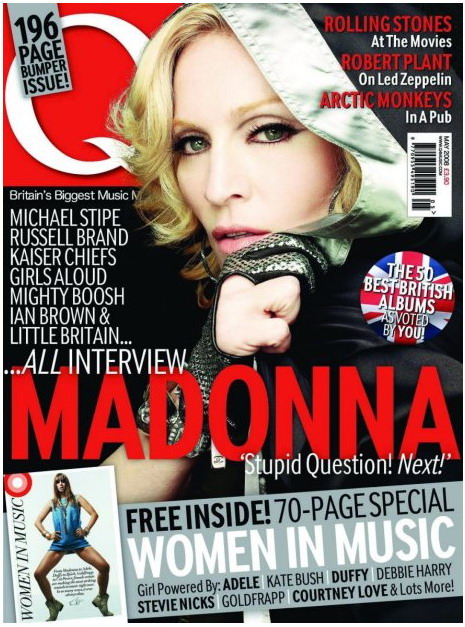
‘Q’ magazine follows the typical conventions of magazines. Featured in the top left hand corner of the splash is the masthead and although it is partly covered by the main image and a tag line, ‘196 page bumper issue’, it is still recognisable to the audience as it is from a mainstream institute and therefore well known.

The main image features Madonna, a well known pop icon around the world, which contributes to the well known vibe the magazine is giving off along with the sell line, ‘Britain’s biggest music magazine’. Part of this text is also covered and contributes to the well known attitude the magazine is portraying. As the text is cut off the editors are aware that the magazine is successful and therefore know that they are able to cover some features with images and text.

The way that Madonna is posing makes the audience feel as though, despite her hand covering part of her body, that she is in power. We get this feel due to the strong eye contact Madonna is making with the camera, and therefore the audience, and also due to the shot of the image. The shot is a medium close up, showing her expression more clearly and showing the audience Madonna’s exact facial expressions, therefore making her feel more powerful and making the audience feel intimidated.

Madonna is also dressed quite controversial, contributing to the feel of the magazine; Q concentrates on music that is quite mainstream but also has elements that are not heard of or not as well known. The image therefore connotes this as Madonna is a well known singer but she is dressed in more edgy clothes which relates to the independent elements of the magazine. The juxtaposition of old and new is also shown. 'Q' includes musical stars that are both old and new and this is also shown through the main image as Madonna is quite an old pop icon but she is wearing clothes that a younger person would wear.

The cover lines on the magazine are all featured in the top right hand side of the splash. They include 'Rolling Stones, at the movies' and 'Arctic Monkeys, in a pub.' This helps the audience feel more involved with the magazine as the things that the stars are doing are everyday things such as, going to the movies and going to the pub. Featured as another cover line is, placed under the bar code, a feature titled 'The 50 Best British Albums As Voted By You', which also contributes to the element of audience involvement especially as the word 'you' is in bold.

The target audience for 'Q' magazine spreads across a wide range due to the magazine featuring both new and old music. 'Q' magazine targets peoples aged predominantly 20-35 and of a male gender due to the bands featured being more masculine such as 'Rolling Stones' 'Kaiser Chiefs' and 'Arctic Monkeys'. However 'Q' also features bands and artists who appeal to females such as 'Girls Aloud' and the cover star 'Madonna'.

Placed directly underneath the cover lines is the bar code, price, date and website. The price of 'Q' magazine is stated as £3.90 which tells us that the audience have to be quite wealthy to be able to afford the magazine. This also shows that the magazine is popular and has earned the ability to become an expensive magazine with the reassurance that people will still buy it.

A banner runs across the bottom third of the magazine's splash which advertises a free 70 page special honouring the most influential women in music. This assists the urge the audience have to buy the magazine because, as 'Q' magazine is already quite expensive the audience feel as though they are getting a bargain with the magazine. The cover line also lists off some of the women included in the special, such as Debbie Harry, Goldfrapp and Courtney love as well as 'lots more'. This makes the audience want to read on as the cover is giving the right amount of information away while still leaving the reader wanting more.

The institute of 'Q magazine' is 'Q'. It has it's own magazine and website and the main purpose of the magazine is to make money. As 'Q's key purpose is to make money the content is affected. Running throughout 'Q' are adverts and features relating to the target audience such as gig advertisments and band interviews.

Friday 6 November 2009

Key Concepts (LIIAR)

There are five key areas/concepts in media studies:

Language: The specific terminology and technical terms used to describe the subject. Media language is predominantly used on the splash of magazine covers for example, masthead, cover line, bar code, but are also used throughout the magazine.

Institution: The organisation that creates media texts, for example, BBC, Q, NME. If these institutes are well known the name on the magazine may be covered as the magazine is already recognisable. Most institutions have websites and some even have a TV channel. The main content in the magazines, used by institutions is entertainment and as most institutions' purpose is to make money adverts are included throughout the magazine.

Ideology: Values, ideas and beliefs that represent ideas about certain stereotypes. They are represented by either single individuals or groups and are a system of beliefs that we are share that include legal and moral values.

Audience: The audience are the consumers of the product that the institutes aim to target. The target audience are the group of people that an institute specifically aim at, for example, 16-19 or 25+. The predominant target audience for most music magazines are 15-25.

Representation: Institutes re-present ideas back to the audiences about British society and social groups along with people, places, objects and events. They also represent values. Respresentation can be shown in either speech, writing or a moving image.

The first letters of the key concepts spell 'LIIAR'

The Brief

Main Task: Produce the front page, contents and double page spread of a new music magazine. All images and text used must be original, produced by you - minimum of four images.